CONTEXT & PROBLEM
A more engaging and collaborative UX for Free Vidyard users.
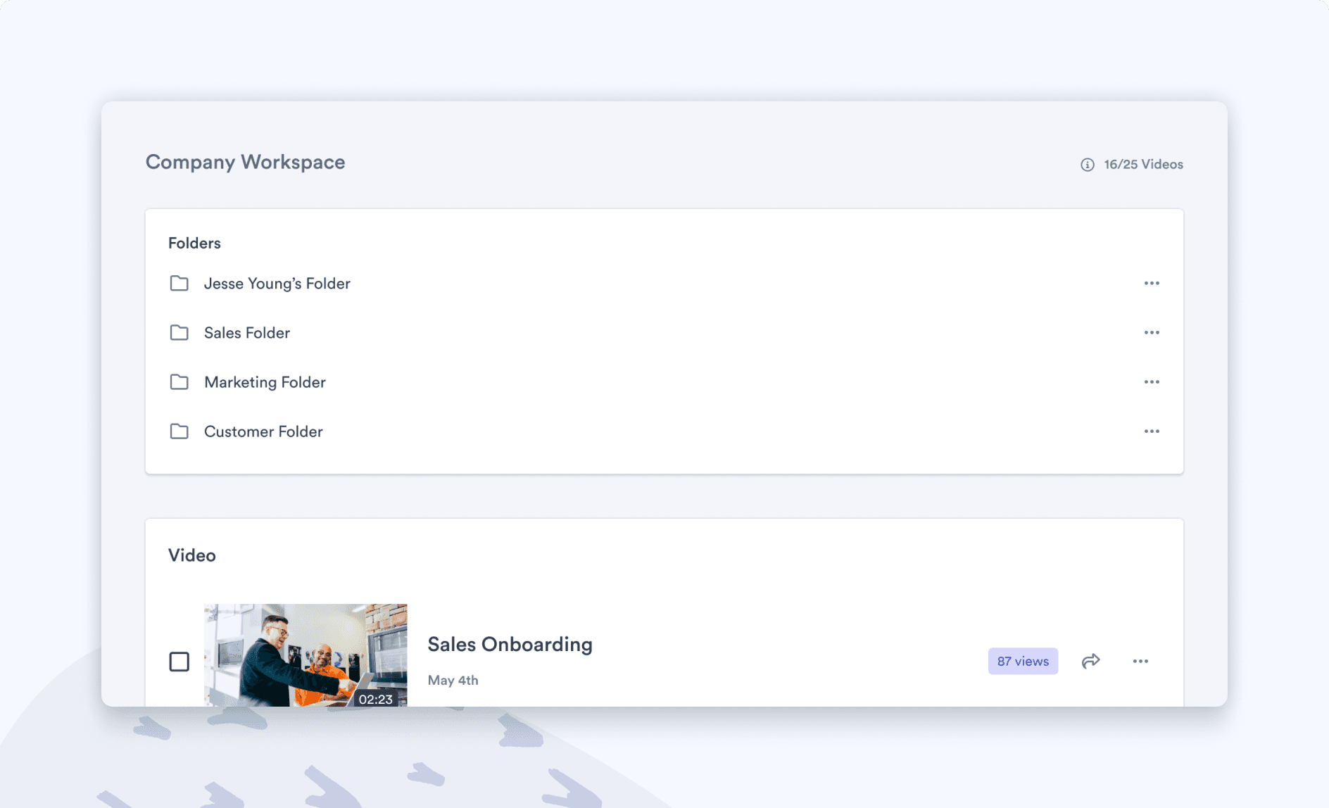
Currently at Vidyard the Free & Pro plans operate in a single-user environment, meaning that those users don't have any exposure to how other Vidyard users are using the product. This has proven to limit account penetration, network effect, and engagement with the product in general. Based on user research that I conducted, we were aware that when new users sign up, they can at times feel overwhelmed and don’t know what type of content to record. However, at the same time, we can see that there are other people from the same organization who have seen strong success with Vidyard. We believed that there was an opportunity to connect self-serve users from the same organization to foster an environment where they can learn/share knowledge and, ultimately, become better sellers.
Given that this was going to be a new product for Vidyard, the project was initially given the title of Vidyard Multi-seat. However, it was renamed to Workspaces following a series of user-sentiment analysis tests that I performed using unmoderated testing which showed that Vidyard users tended to prefer the name Workspaces.
——
HIGH-LEVEL PROBLEM
Breaking down the problem.
The scope of Workspaces was very big and it could get overwhelming for the team if we tackle everything at the same time. Instead, we planned to break down the project into two phases:
MVP: Empower sellers by providing them with a multiplayer environment.
Growth Phase: Create growth/engagement loops by making incremental gains.
By decoupling Workspaces, we were able to ensure that we could build a strong base first which can sustain future projects, and will be optimized for growth/engagement loops. This also led to the creation of our first initial hypothesis:
"We believe that there are other users from the same organization that have seen strong success with Vidyard and new users can learn from them to become better sellers."
——
GUIDING PRINCIPLES & SUCCESS METRICS
Establishing a direction using principles.
To make sure that the team was going in the right direction, we created the following principles to guide ourselves through this new self-serve future.
We will lean on convention to ensure this new experience aligns with the remainder of Vidyards product suite.
A multi-user environment already exists in our Business Product. We plan on bringing that product down to the self-serve tiers and using it as a baseline to build from.
We learned that Workspaces can act as two different levers:
Engagement & Monetization lever: Sellers’ creating content drives more engagement, which will lead to more users hitting limits.
Acquisition lever: Workspaces will help sellers bring other high-quality sellers (coworkers) into the product.
We believe that giving sellers the ability to improve their craft by learning & inspiring each other will help them succeed with video and ultimately drive more engagement, as a result, the success metric that we were using for this project was Daily Active Users (DAUs).
——
RESEARCH
Gaining clarity on the problem space.
Three core research methods were used to collect insights before we moved into a shaping phase for this project. The first method that was used was moderated user interviews, during these sessions, we learned from users that some were keen to learn from other people’s success and to help inspire other users from their company. The second approach involved leveraging Appcues to run a Fake Door test, during which we were able to validate the core motivations for users behind working together at a larger scale. We ran this test with the Enterprise segment of users, during which it was completed by 5,436 users, and it uncovered that the two largest motivations for users behind working with others are education (wanting to level up their video skills by seeing what others are doing) & social capital (wondering how their videos are performing relative to their colleagues using views as a core metric). The final method involved completing research with internal Vidyard employees to identify any potential cannibalization risks or adoption risks for our Sales team. Both of these points were proven to be non-issues and we were cleared to proceed into a shaping phase for the project.
——
CONSTRAINTS
Establishing technical restrictions.
For this project, we operated with three core restrictions, some of which were put in place for technical reasons, and others were as a result of a desire to ensure that we did not inflate the scope of the initial MVP.
There can only be 1 Workspace per email domain. This restriction caused the need to create both a Join & Create flow for all flows that involve accessing a Workspace.
If an email domain had an Enterprise account they could not see the Workspace experience. This was an MVP restriction that was caused by a desire to not complicate the process of getting users into an Enterprise account.
For the MVP, users would need to leave a Workspace before upgrading to Pro. This was a short-term constraint and was later fixed as a part of the Growth phase of this project.
——
INITIAL DESIGNS
Start of prototyping.
As the Lead Product Designer for the product, I focused the design effort on three core areas that would be needed to release an MVP. Most of the other experiences could be adapted from our existing Enterprise Product. Overall I implemented a very iterative design approach to all of the screens completed for this project, starting with sketches, moving to wireframes, and frequently conducting design critique sessions with other members of the design and product management team.
The first area focused on what I called Workspace Management. This involved building out a core area of the product that would allow a user to complete the action of managing the users that are within the workspace, changing the name of the workspace, upgrading the workspace, and leaving the workspace. This experience was the first to be built, as we took a very streamlined approach to the design. We leveraged a reusable card component to ensure the designs were consistent, and borrowed from industry best practice for user management to ensure that we were not breaking any design patterns.
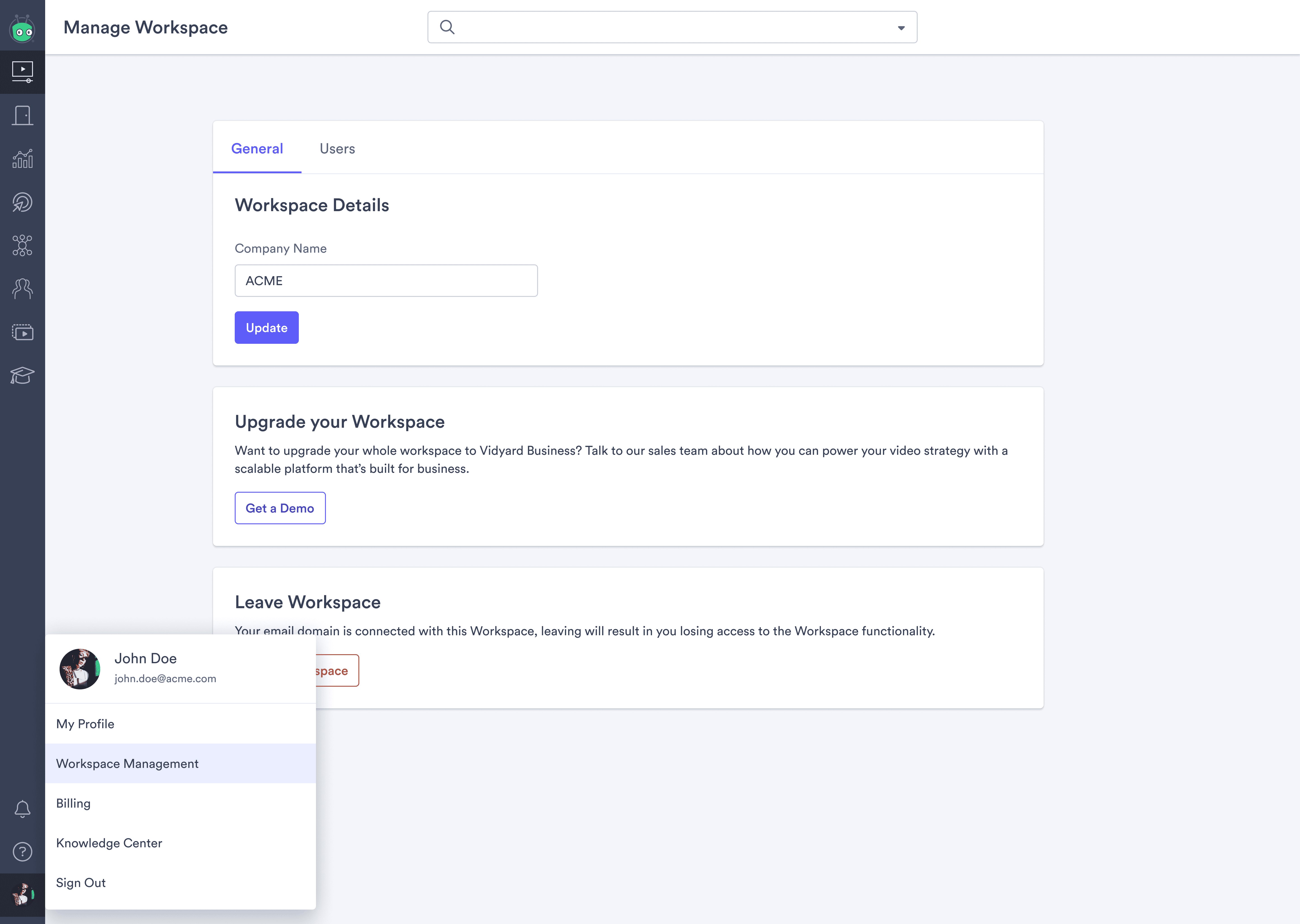
Initial Designs of Workspace Management
The second area of focus was Onboarding, as we had no way for a user to join a multi-user environment in a self-serve way. For this, I conducted an audit of our existing Onboarding experience for Free users and identified where in the flow it could make sense to inject the new Workspace experience.
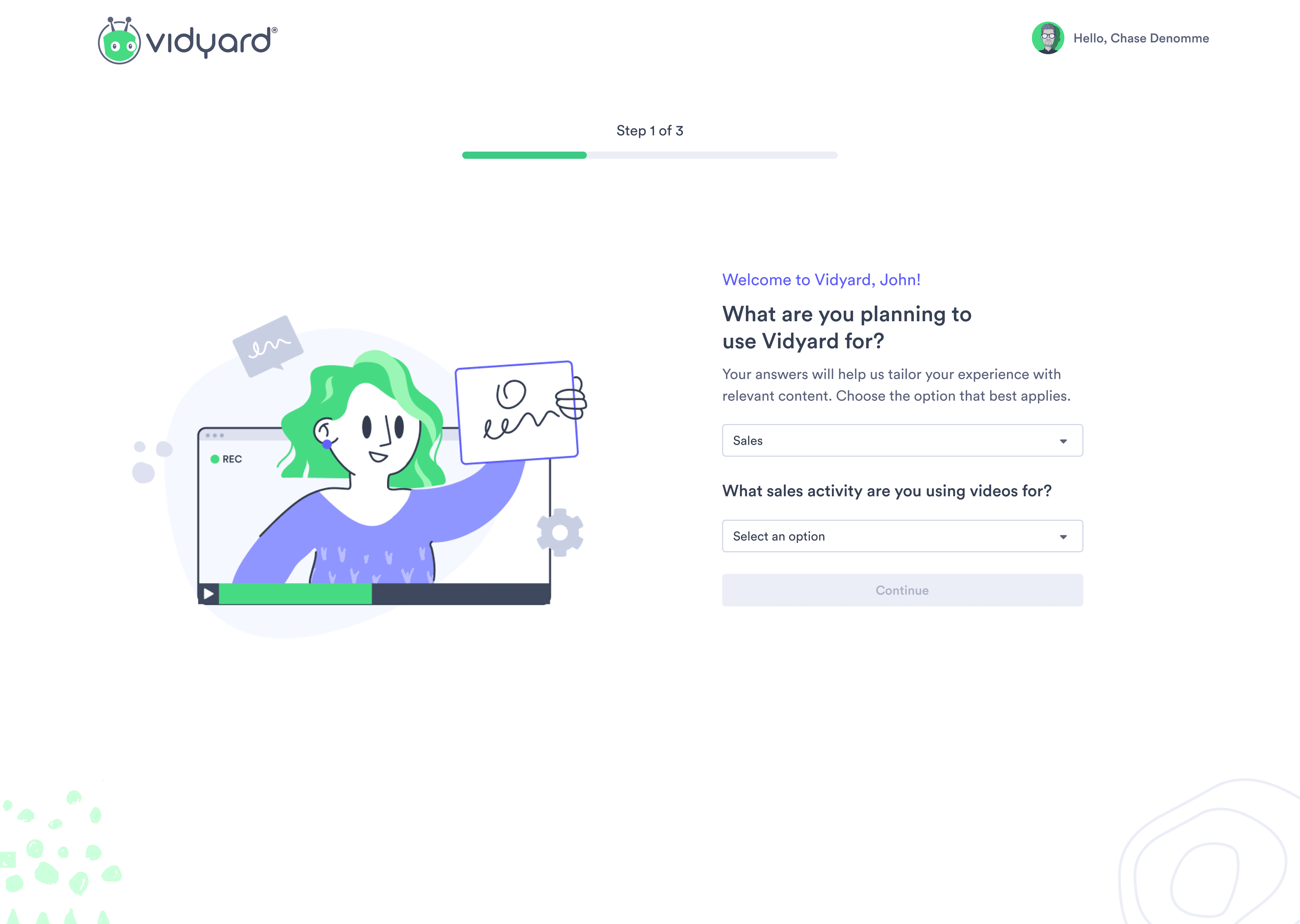
One of the Original Onboarding Screens
As a result of the project constraint relating to there needing to be only 1 Workspace per domain, I started to think through what the flow would be like for the cases where a Workspace exists underneath their domain (a "Join flow"), and where a Workspace doesn't exist (a "Create flow"). I knew that invites would be a core part of the Workspace, but I wanted to ensure that we surfaced that screen at the appropriate time. So I got started on some rapid unmoderated user research using UserTesting.com to see how likely a user would be to invite a user during the Join Workspace experience versus the Create Workspace experience. The results were interesting, I found that 62.3% of users would be interested in inviting a user following the creation of a Workspace, whereas only 9.6% would be interested in following them joining a Workspace. This showed me that creating a Workspace created a greater sense of investment in the Workspace, while when a user joins a Workspace that was created by someone else, they are more interested in seeing what it has to offer before inviting another user.
These findings led to me initially designing three screens for Workspace Onboarding, the first being a Join Workspace screen, which would be shown to users when a Workspace already exists underneath their email domain, and would simply allow them to Join the Workspace, or proceed to the solo user experience. The next two screens both focused on the act of creating a Workspace. In this case, the first screen in the flow prompted the user to create a workspace and provide a workspace name, the ensuing screen allowed users to invite other users from their domain to the workspace once they had successfully created it.
Throughout these screens, many optimizations were identified and marked as future considerations that we would re-evaluate during our Growth Phase.
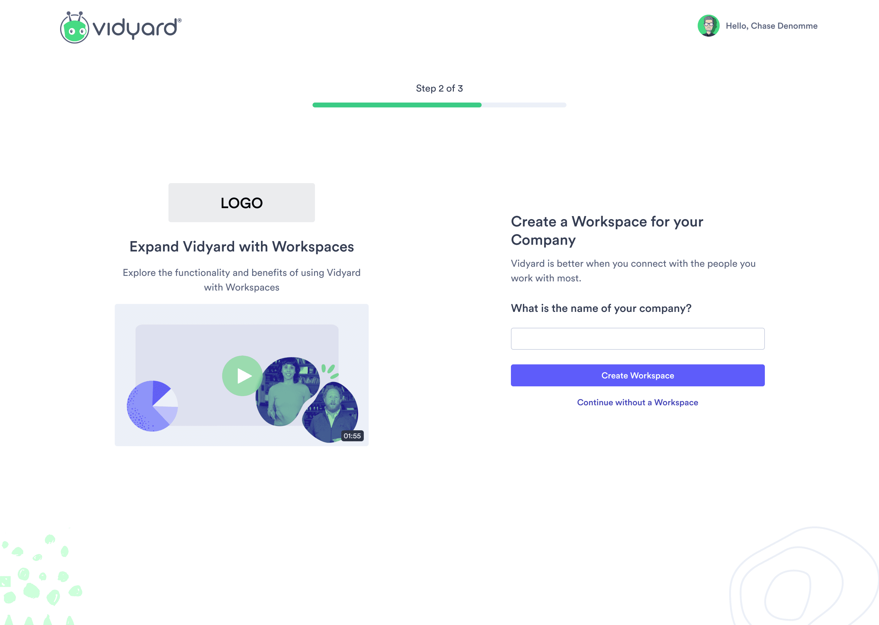
Initial Medium Fidelity Create Workspace Screen
The last bucket of core design work focused on getting our existing Vidyard Free users into a Workspace. For this, I conducted a variety of competitive research to see what techniques have been successfully employed to get users to join a new product experience.
There ended up being three approaches that we took to ensure that we met our MVP release target, and were not overly intrusive in the workflow of our existing users:
A modal that I designed and created using Appcues that would launch upon the launch of workspaces.
A banner that would sit at the top of the screen until dismissed by users.
A permanent card that would sit within our profile menu.
For these three designs, I took the approach of having three different tiers of intrusiveness, one experience that is very intrusive, but easily dismissable (the modal). Another experience that is persistent to users, but still dismissable (the banner). Lastly, there was the permanent card, which was not at all intrusive, but also not dismissible. Our goal was to analyze the performance of these three methods and analyze which performed best, we would then look to further invest in this area in the planned Growth phase.
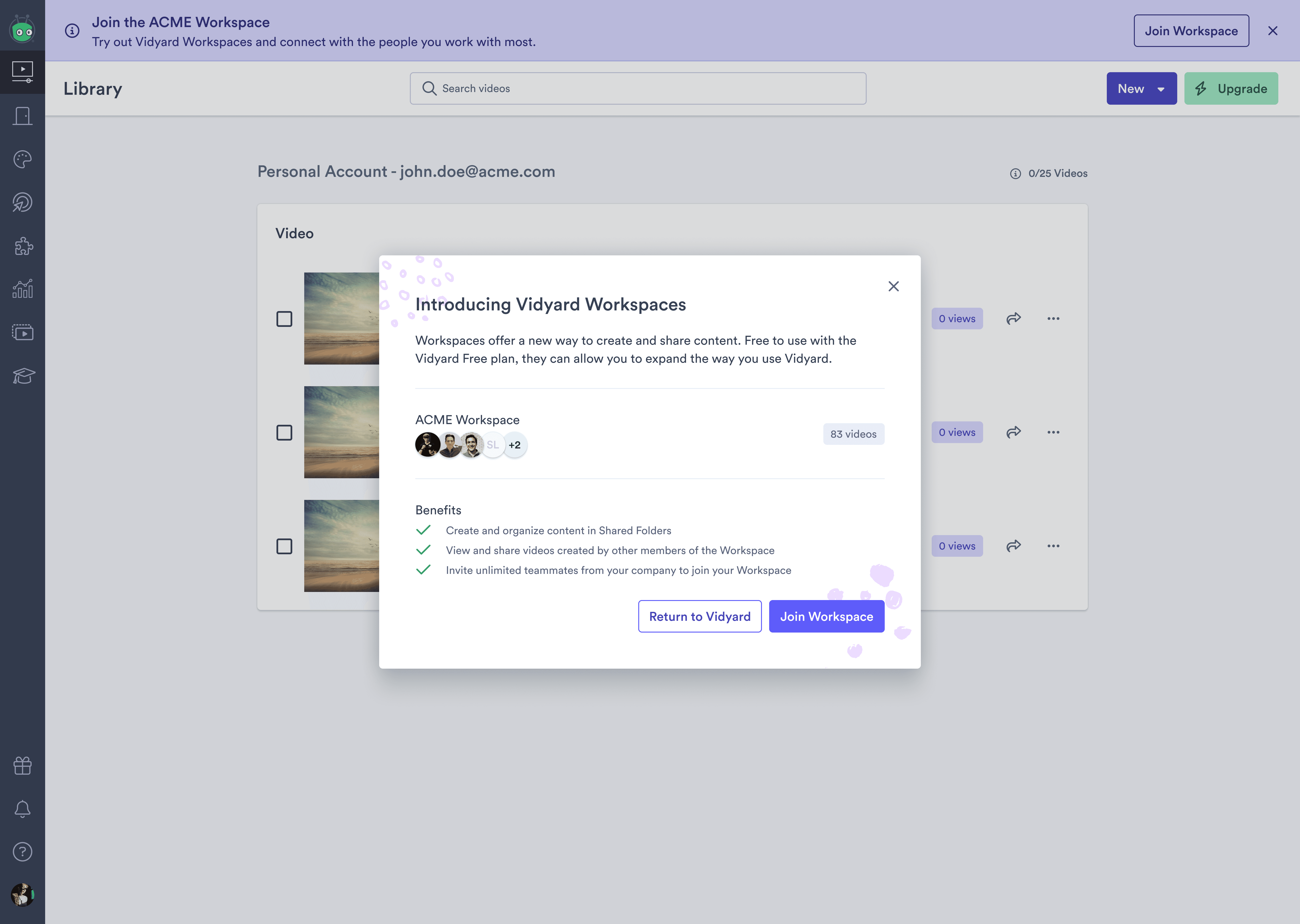
Initial In-Product Prompts
Many other areas of the product were also designed in the later stages of the MVP including the Video Edit Page, Video Library, and integrations page to mention a few.
——
USER RESEARCH & RELEASE OF MVP
User feedback & slight UX changes.
With an initial version of the designs completed, I planned out a week to conduct user testing on both the onboarding and in-product experience of Workspaces, with the hope of refining the designs further. This involved creating two prototypes in Figma and launching a series of unmoderated user tests. In addition to unmoderated tests, we also conducted five interviews with active Vidyard Free users who showed interest in exploring a multi-user environment.
Once the interviews and research were completed, I went through and collected all of the relevant user feedback in a spreadsheet and then translated it to a FigJam file to demonstrate where the design changes needed to be made. Core changes were made to the Workspace creation screen and the user invitation screen. We were leveraging a very informative design to help educate users about Workspaces, and one of the pieces of feedback that we received was that the left side of the page was too visually heavy, and drew the user's attention away from the core actions we wanted them to complete.
When it came to the invite screen, we learned that despite the earlier testing that we completed, users were still unsure about inviting other users. To try and address this I created an illustration that outlined the invitation process and retested the experience. Adding this illustration led to users being 28% more likely to invite another user at this stage.
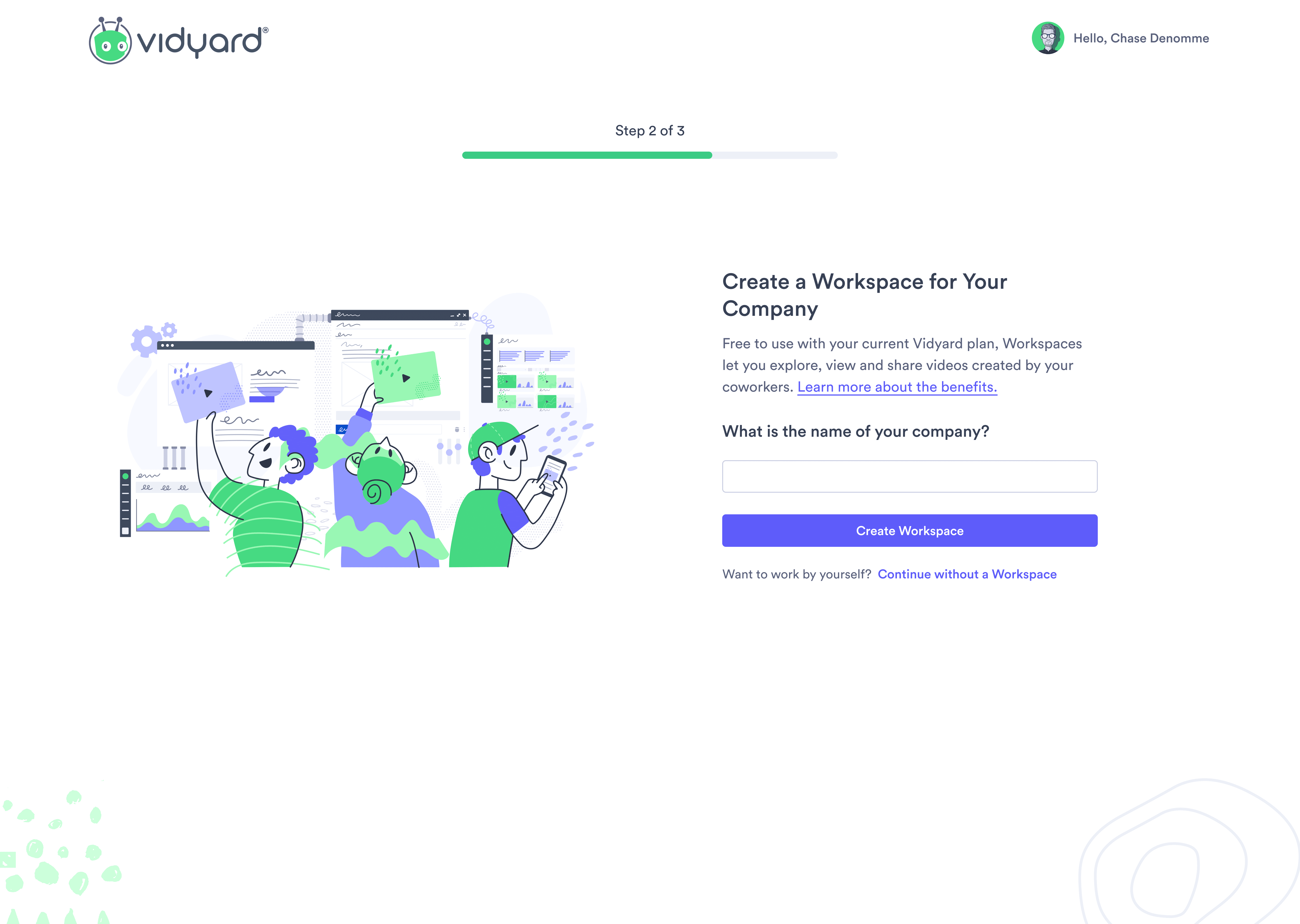
MVP Release for Create Workspace Onboarding Flow
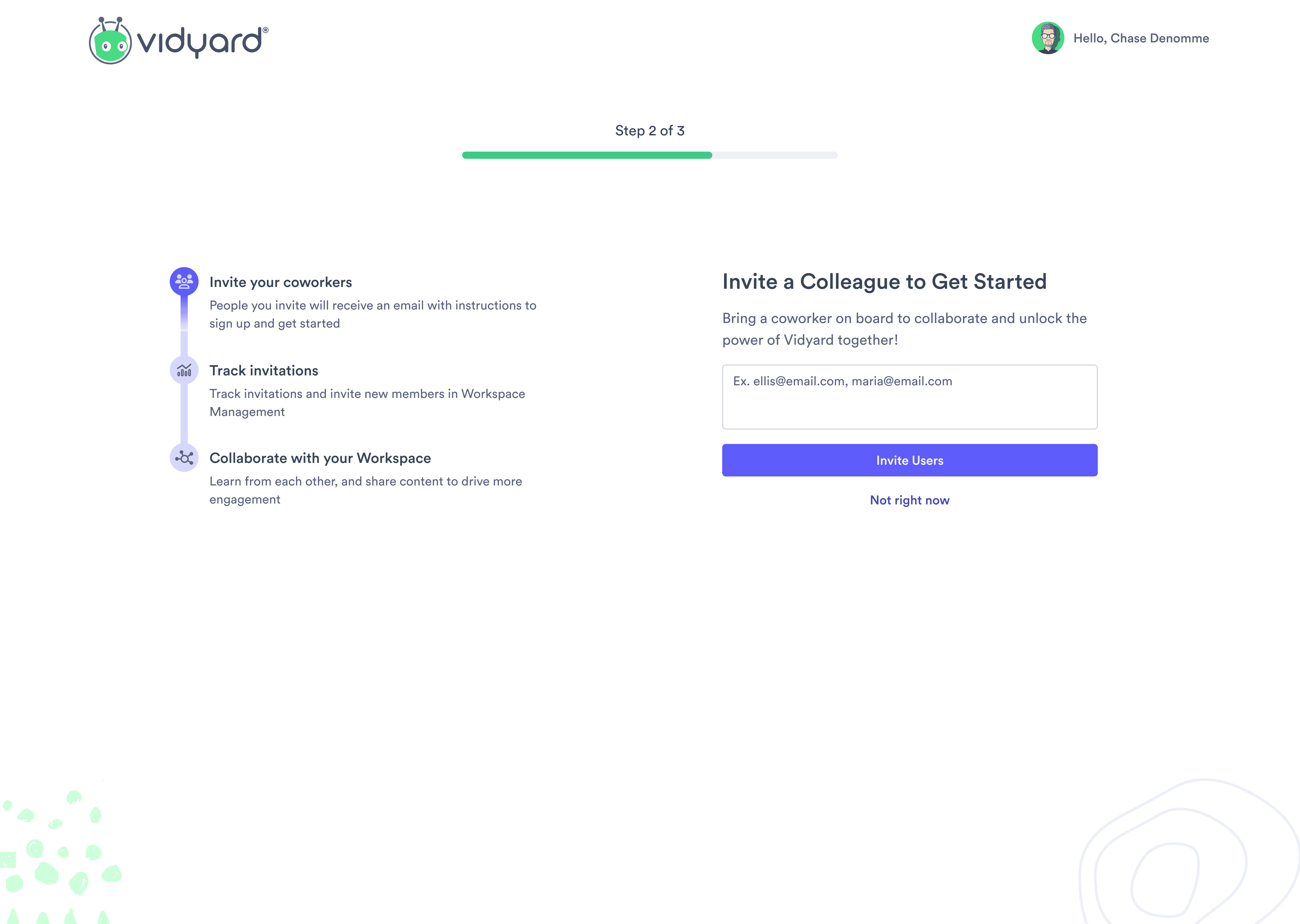
MVP Release for Create Workspace Invite Flow
With these design changes in place, as well as a few other optimizations, I completed the initial design process for the MVP release. We then got started with the formal build of the experience and started preparing all of the necessary dashboards that we would need in Heap to ensure that we were able to track data once we launched so that we could effectively draw some conclusions from the MVP.
——
LEARNINGS & GROWTH PHASE
Changes in user behaviour and need for slight optimizations.
Once the MVP of Workspaces was released we took some time to enter a monitoring phase for the project, where we spent time analyzing data, talking with users, and tracking incoming customer success tickets. There were two core learnings that we gained post-release:
An overwhelming majority of users joined or created a Workspace during New User Onboarding.
Once users were in a Workspace they were having a difficult time figuring out how to invite other users.
This led to us creating three different areas on which we wanted to focus our Growth experiments:
Improving the invite experience to boost the number of invites that are sent.
Optimize the Onboarding language to see if we can further bolster the number of users who join via New User Onboarding.
Spend time improving the prompts that we surfaced to current Vidyard users to see if we could bring more of them into a Workspace.
We distilled these three areas of focus into two core metrics, the first being the Average # of Users/Workspace (AUW), as initially post-release our AUW metric was sitting at 1.06, so we set a goal of getting it to 1.30. The secondary metric that we focused on was the # of Invites Sent. Throughout the Growth Phase of this project, we released a total of 17 experiments and optimizations with those two main metrics in mind.
Throughout the optimization phase, we managed to push our AUW metric to 1.43. The biggest experiment that led to this boost was having a strong focus on bolstering the invite experience, to improve this we added an invite hub to the main home page of the product and added a quick-invite functionality that lived within the invite modal itself. This functionality essentially displayed other Vidyard users from their company and allowed them to invite them in one click. This cut out the need for users to have to think about who they wanted to invite, recall their email, and complete the invite process.
Overall Workspaces was deemed to be a success for Vidyard and led to an increase in our engagement metrics for users in a Workspace when compared to those who are working by themselves. The success of this project has led us to make more investments in the multi-user self-serve space going forward!
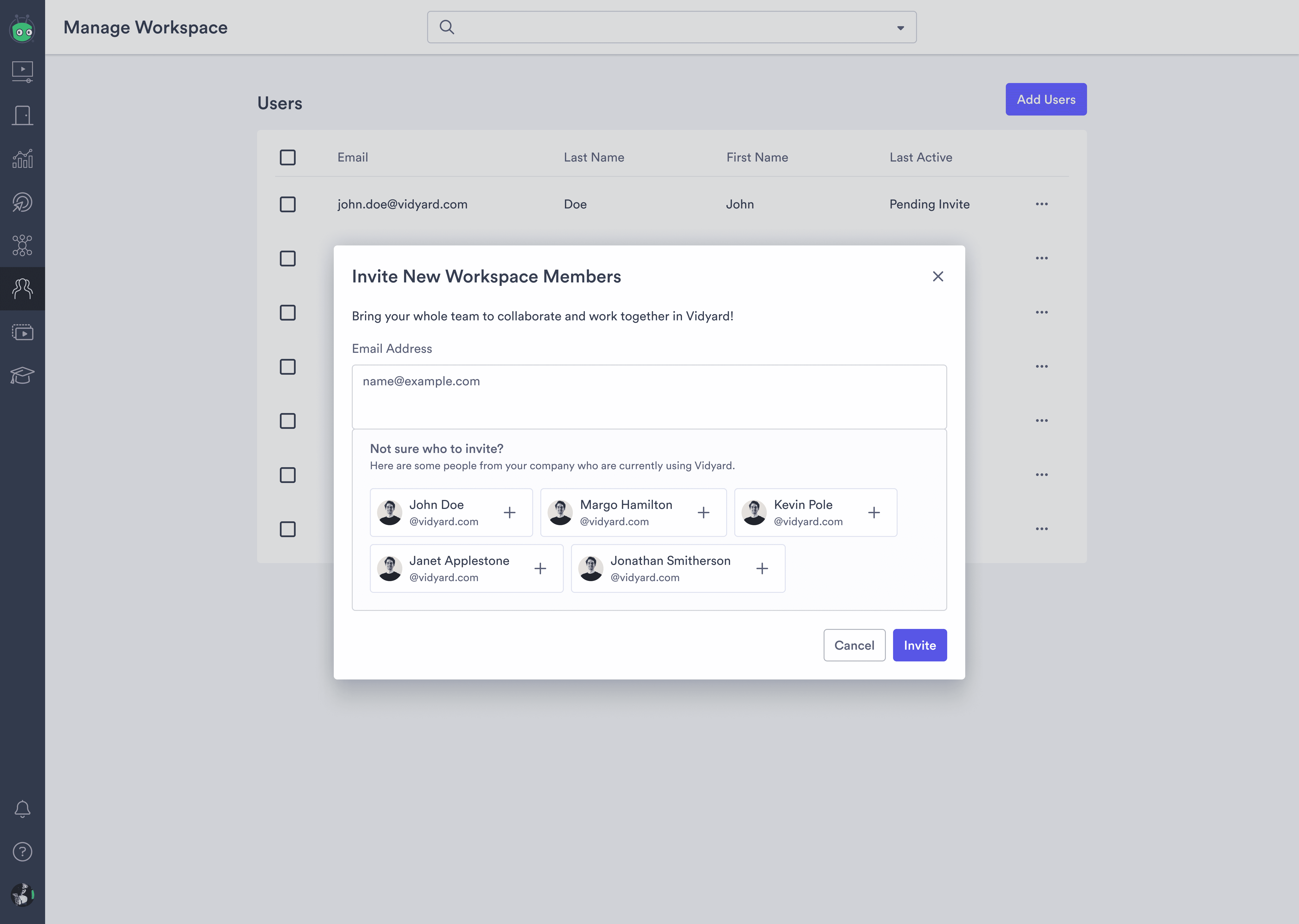
Adjustments to Add Users Modal
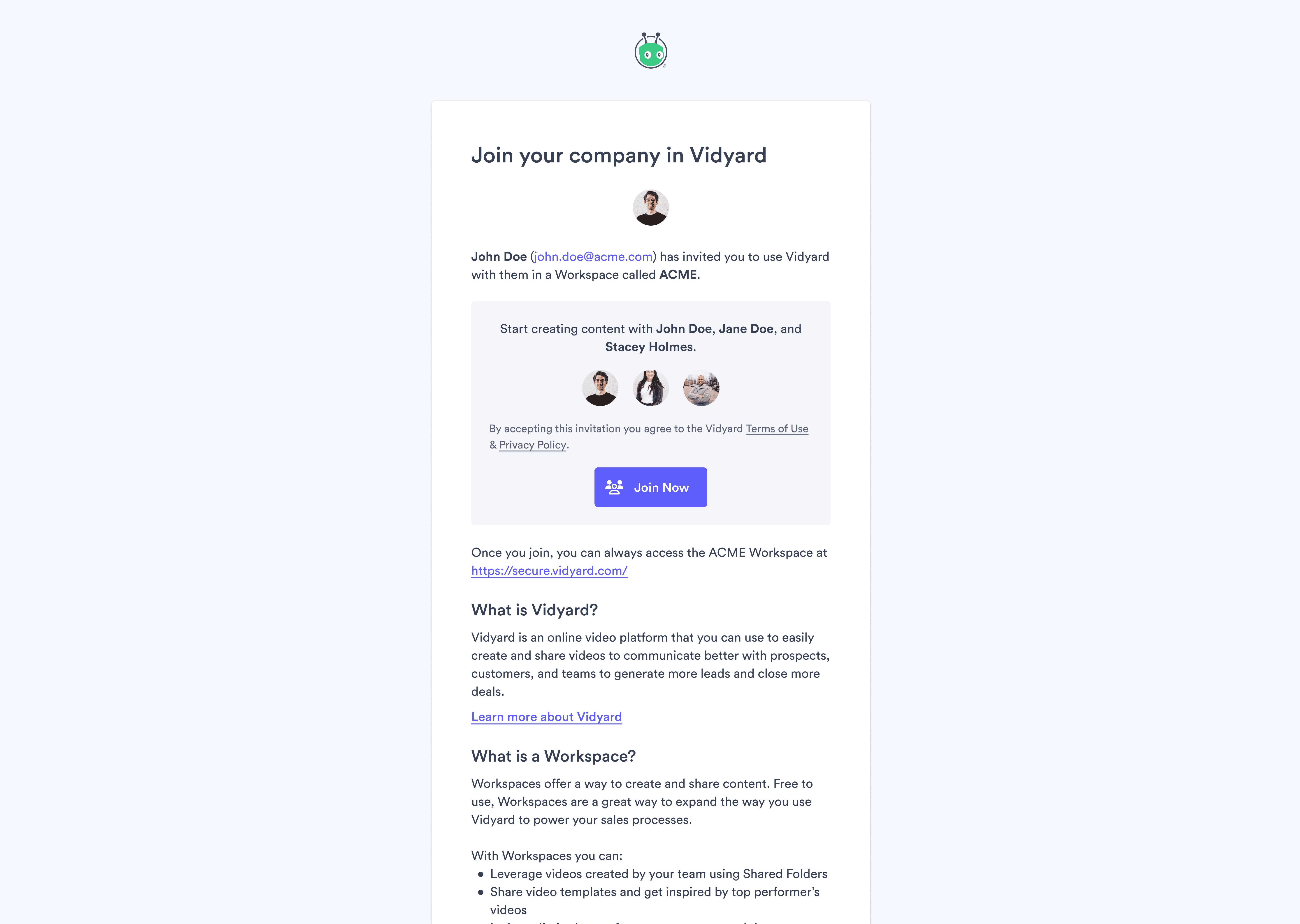
Re-designed Invite Email
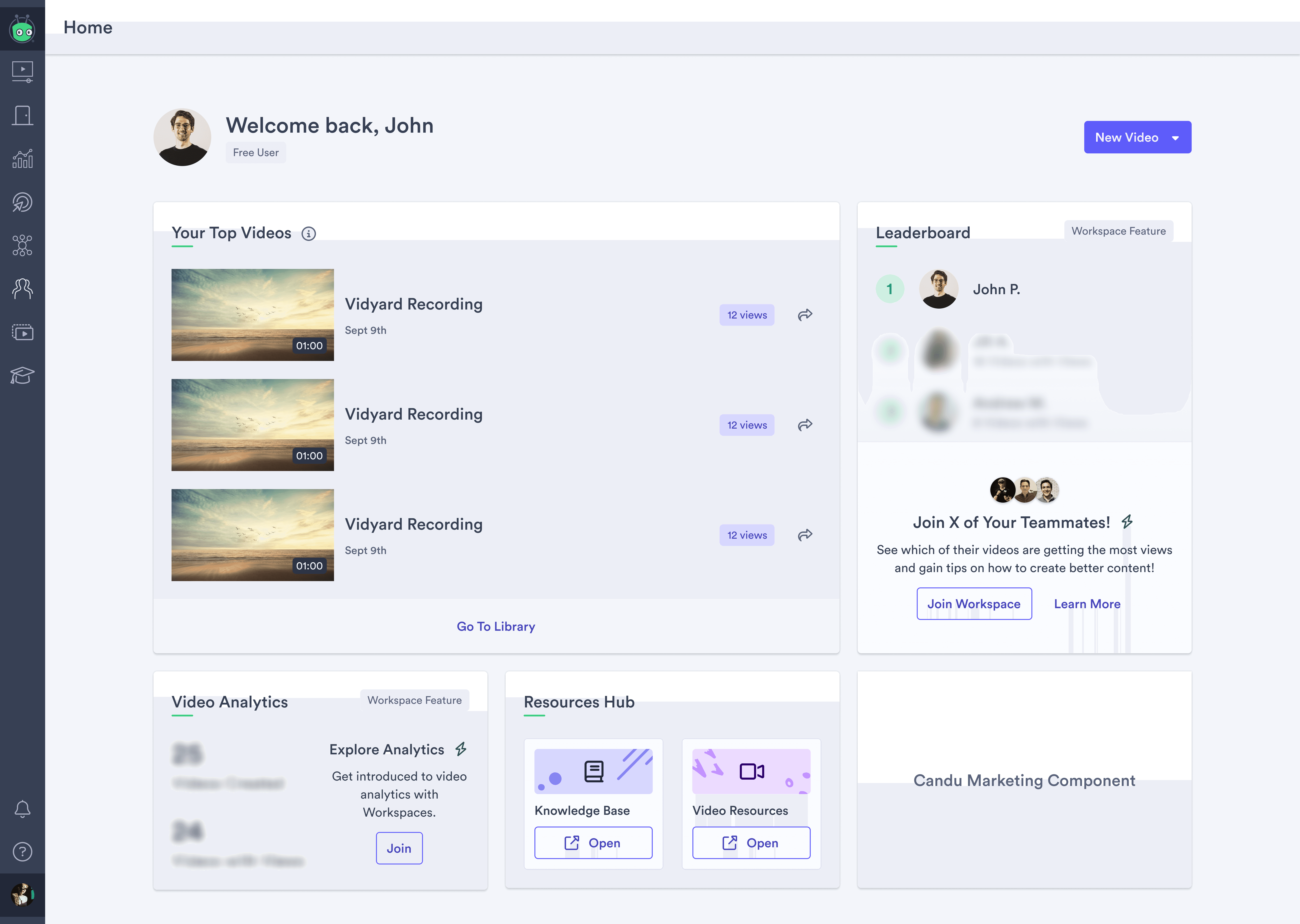
New Invite Prompts on Home Page
