SUMMARY
A Smoother Payments Experience for Versapay Users.
At Versapay our goal was to work towards bringing together and unifying the product offerings of four payments companies that were combined in a March 2020 acquisition. Across these different companies, many small intricacies make their respective product offerings very different. The focal company of these four businesses is Versapay, with the three additional brands possessing products with a focus on various ERP (Enterprise Resource Planning) platforms.
The goal of the initiative covered in this case study was to take the hosted payment page experiences of all of the companies and unify them, which would allow Versapay to present a single brand and user experience to its many customers. To accomplish this, a project was initiated to complete a new Pay-Now Page, with the goal of having it completed within 3 months.
Within that period, four design iterations were completed to ensure that the look and feel of the Pay-Now flow met the requirements put forth by the project stakeholders.
——
PROBLEM
Unifying the Versapay Payments Experience.
As mentioned above, across Versapay’s suite of products, there were four different versions of a hosted payment page, one in ARC (Versapays main product offering), then one in each of Microsoft Business Central, Intacct, and NetSuite (which are the main ERPs used by the other Versapay companies). In their current form, each of these hosted payment pages utilized different layouts, with different user experiences. This fact made creating a new consolidated look for the page a very interesting and compelling challenge.
All of the existing hosted payment pages were eventually going to be replaced with this new flow, which meant that there was no attachment to any of the existing branding, colors, or components used. This project was essentially viewed by the stakeholders of the project as an opportunity to start fresh. The main problem for this page though was to ensure that some aspects of the pre-existing pages persisted, to guarantee that the users of the platform didn’t perceive this update as a downgrade, but instead as a noticeable improvement.
——
REQUIREMENTS
Working collectively to try and find a solution.
To begin the requirements gathering process, I created an extensive list of the features offered by each existing hosted payment page and looked to see which were common features, and which were outliers. With these lists in hand, data on the user behavior within each page and user interviews were used to identify which features would have the highest impact on the end-users. The following are the highest priority requirements that were identified for the initial version of the Pay-Now Page:
The ability to pay invoices with either a Payment Card or a USD Bank Account.
A display of the Invoice Total with the capacity to show discount and surcharge information.
Outline the Invoice # and Invoice Total for each respective Invoice included in the payment.
The ability to download the Invoice by clicking on the Invoice #.
A “Thank You” page to present the user with a Payment Confirmation message.
With these requirements in mind, two main User Stories were identified to help guide the ideation and design process.
I am a Large Company going to bulk pay multiple invoices at once and I need a solution to easily facilitate the payment.
I am a Small Business Owner that owes money on various invoices, but can only pay a select few due to financial constraints.
——
LOW FIDELITY PROTOTYPES
Initial Wireframes.
In the initial design phase, I used sketching and wireframing techniques to come up with a variety of different approaches that could be taken to tackle this problem. Below three of those solutions are shown to demonstrate the process that was taken.
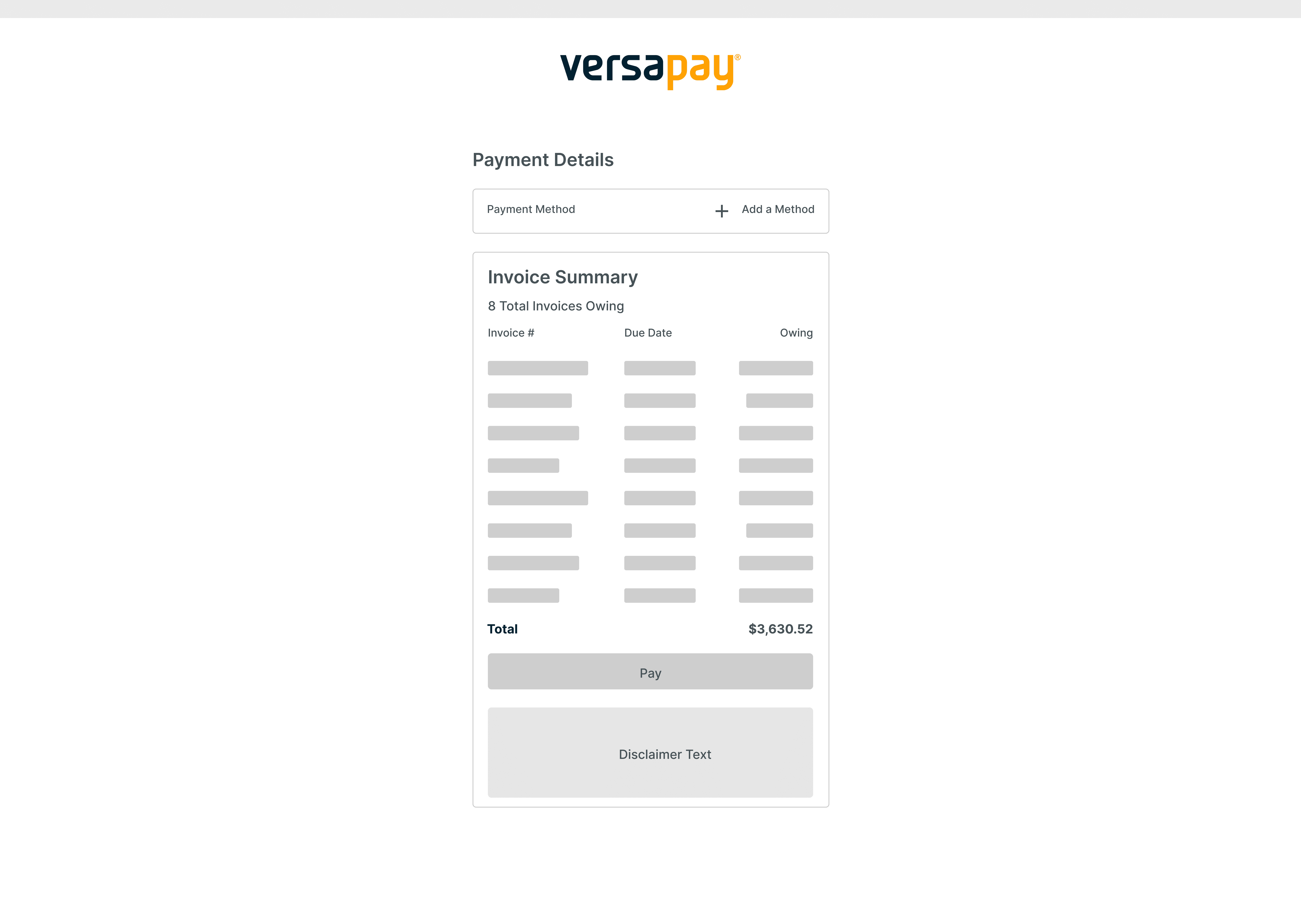
The first design took a modular approach to the solution, with the payment method, summary of payment, and disclaimer information appearing in their respective containers. A modular approach was taken to allow for more customization by our end-users, as it is incredibly common for Versapay customers to make Javascript, HTML, & CSS changes to our pages to add their branding to the page.
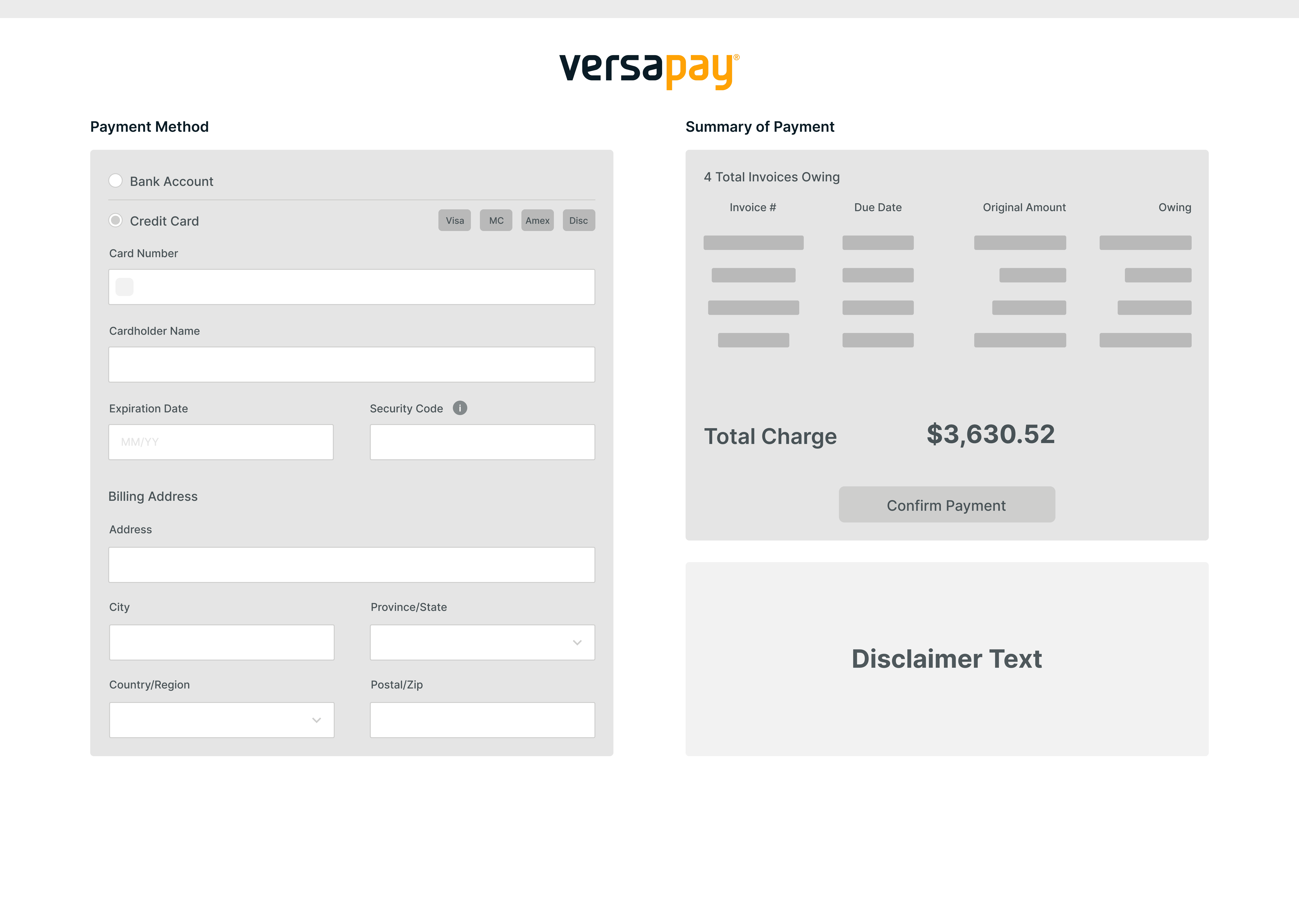
Wireframe Solution #1
The second wireframe followed the design pattern of your typical checkout page experience, with the order/invoice details on one side, and the payment information on the other. Relative to the previous wireframe, this design presented a flexible option that would allow for the presentation of multiple invoices while keeping all of the content in a reasonably sized frame.
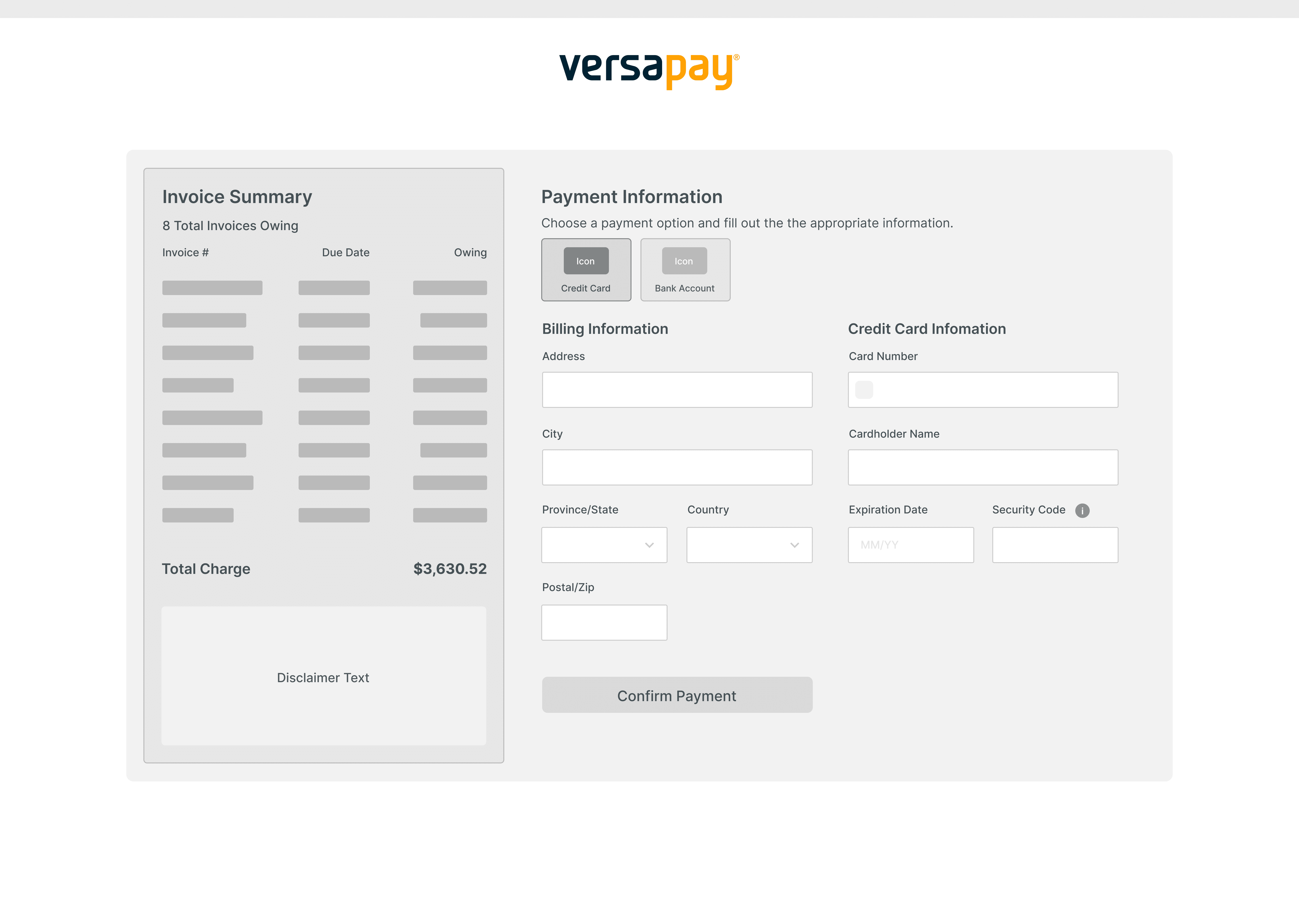
Wireframe Solution #2
In the final wireframe, strong mobile considerations were taken to ensure that the page would load responsively on smaller screen sizes. The current Versapay Payment products are not responsive, and thus do not render very well on mobile. As a result, I wanted to change our product thinking to more of a mobile-first approach, to ensure that all users can effectively utilize our product suite.
Wireframe Solution #3
Following the completion of these wireframes, I presented them to the key project stakeholders, as well as a select group of end-users. The goal of these walkthroughs was to receive feedback on the various directions I was exploring and to see if there was any additional insight that could be considered to ensure that the project requirements were being appropriately met.
The result of these discussions ended up being an additional iteration on the wireframe solution that leveraged the traditional checkout approach. The rationale behind this decision was that our end-users loved the familiar layout of the page, and the project stakeholders liked that the page could be easily repurposed as an e-commerce checkout down the road.
A key change that was made was allowing users to have the ability to pick and choose which Invoices to pay. Our end-users mentioned that very frequently their customers will not want to be forced to pay all of the allocated invoices, and instead pay a select group of invoices. This could be because our end-users customers may want to dispute some of the invoices based on invoice total or line-items included in the invoice.
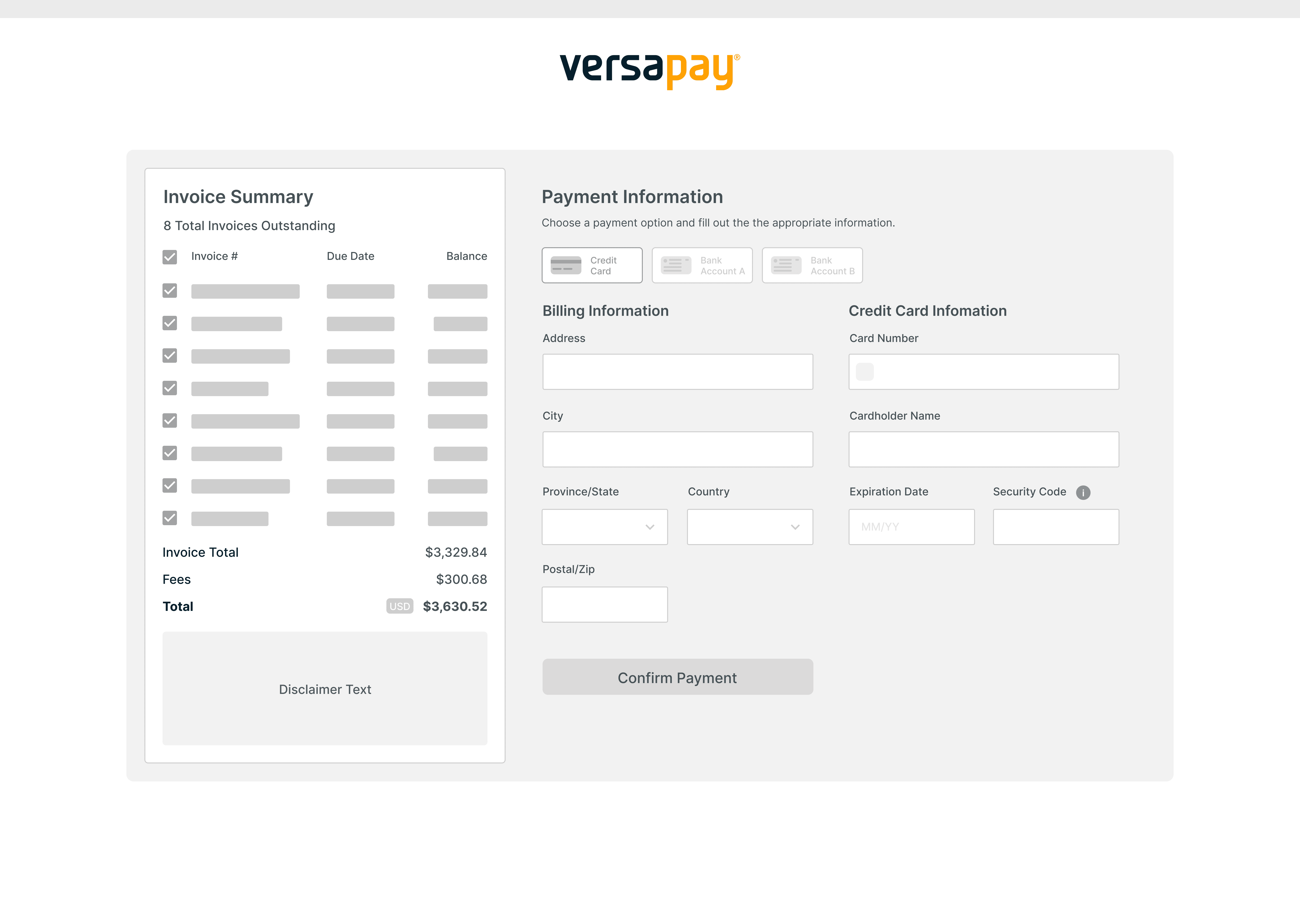
Second Iteration Wireframe
——
THIRD ITERATION
More Refined Prototypes.
Once the sketches and wireframes were completed, I proceeded to create some more high-fidelity mockups of how this Pay-Now Page could flow. I created designs for both how the Payment Card and Bank Account payment screens could look, as they each had slightly different requirements. Some pages are not featured below surrounding the input of Bank Account information for Canadian Dollar & Australian Dollar accounts.
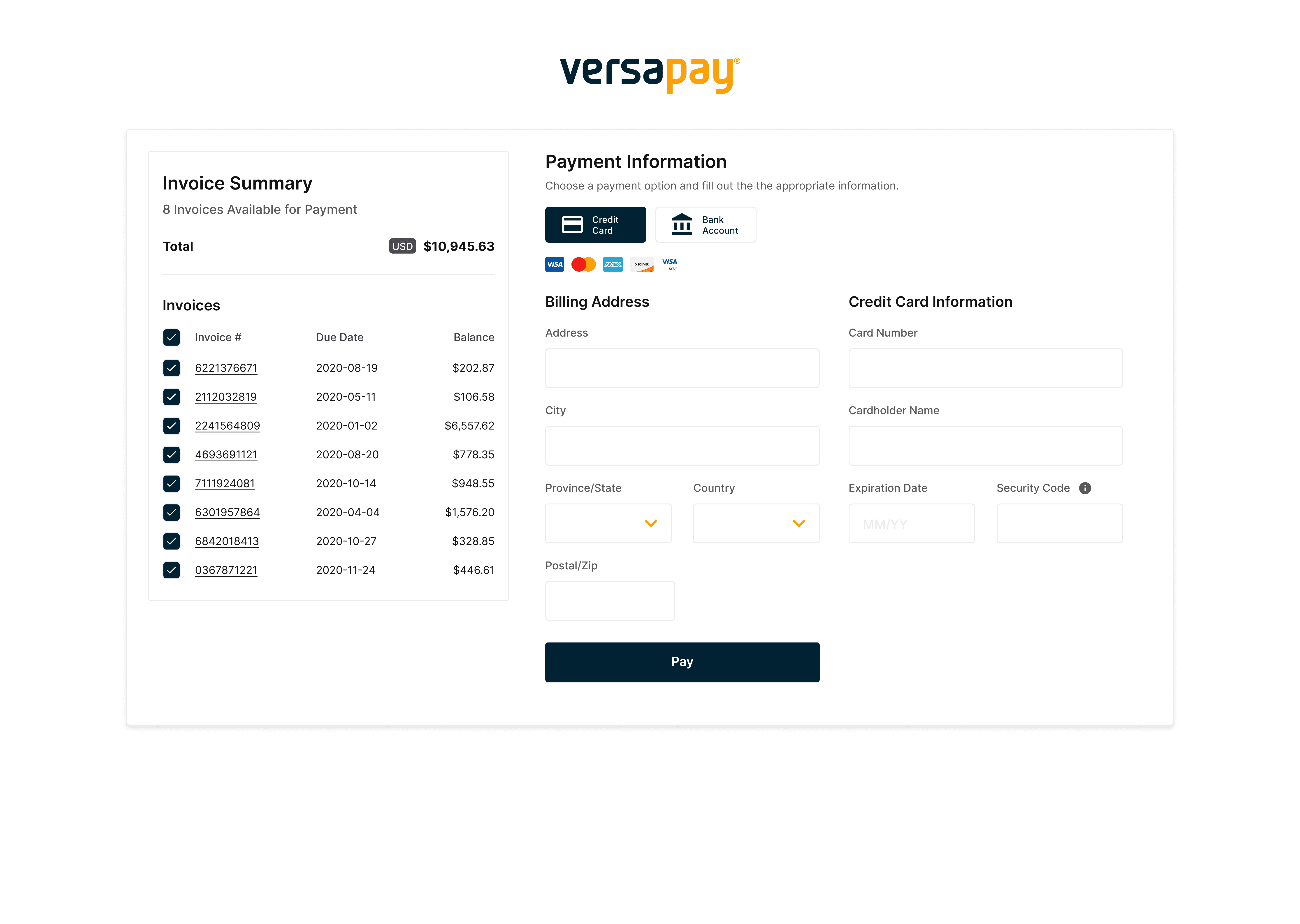
3rd Iteration Credit Card Prototype
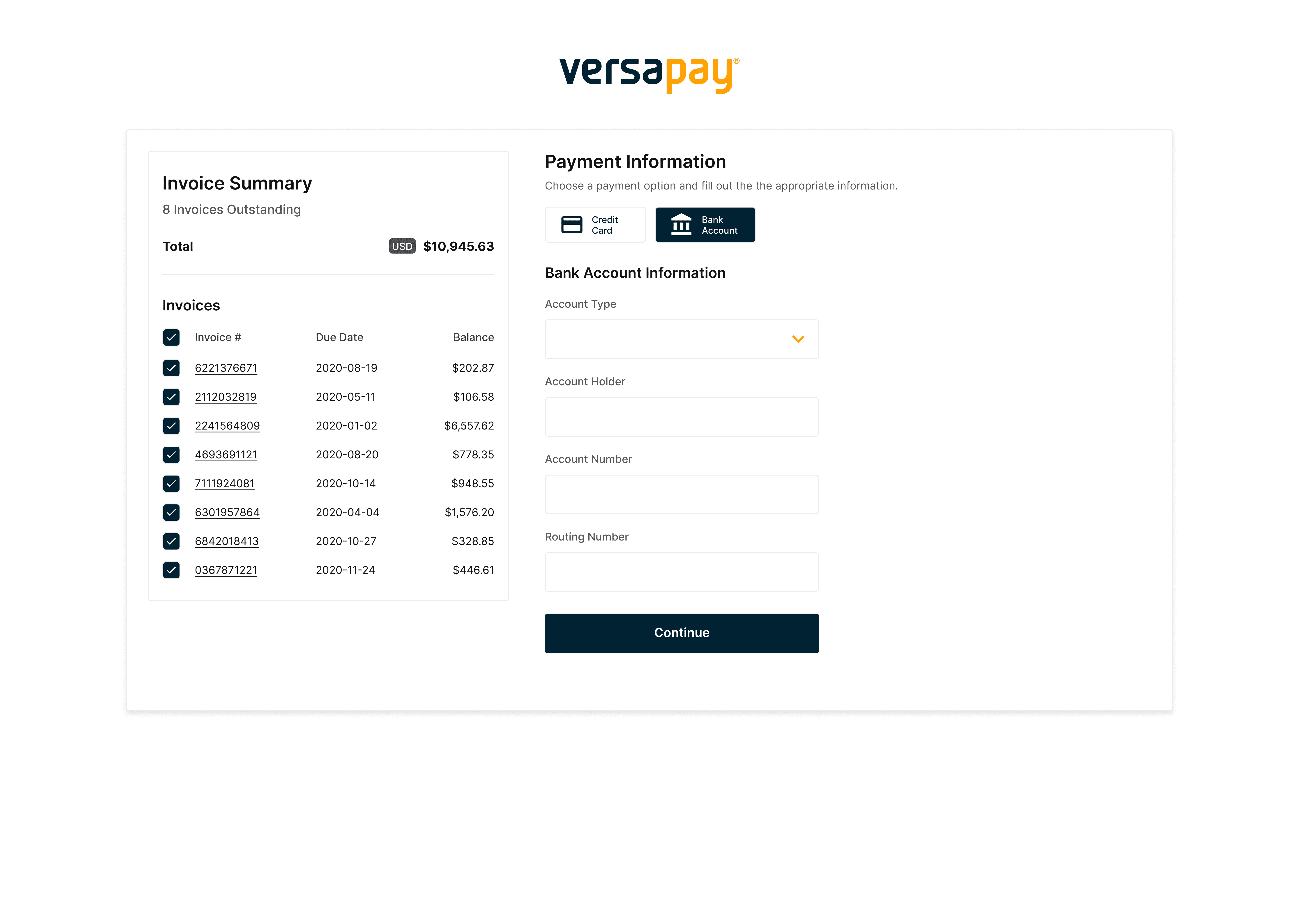
3rd Iteration Bank Account Prototype
A detail that needed to be addressed on this page surrounded how our customer's customized branding could be pulled into the page and appropriately applied. In this case, the primary and secondary colors for Versapay are navy and orange, so as a result, the customizable elements on the page included the checkboxes, the Pay button, and the payment method toggle.
——
FINAL DESIGN ITERATION
User Feedback & Slight Changes.
With these more refined high-fidelity prototypes in hand, I once again presented them back to both our project stakeholders as well as the group of end-users. We walked both groups through the flow of getting to this page, and the many different paths that the user could take depending on their ERP setup. One key enhancement that was identified was adding in the Billing Address information to the Bank Account form, both for consistency across the Payment Card and Bank Account forms, as well as to allow our system to have this data on hand for the financial institutions that we interact with.
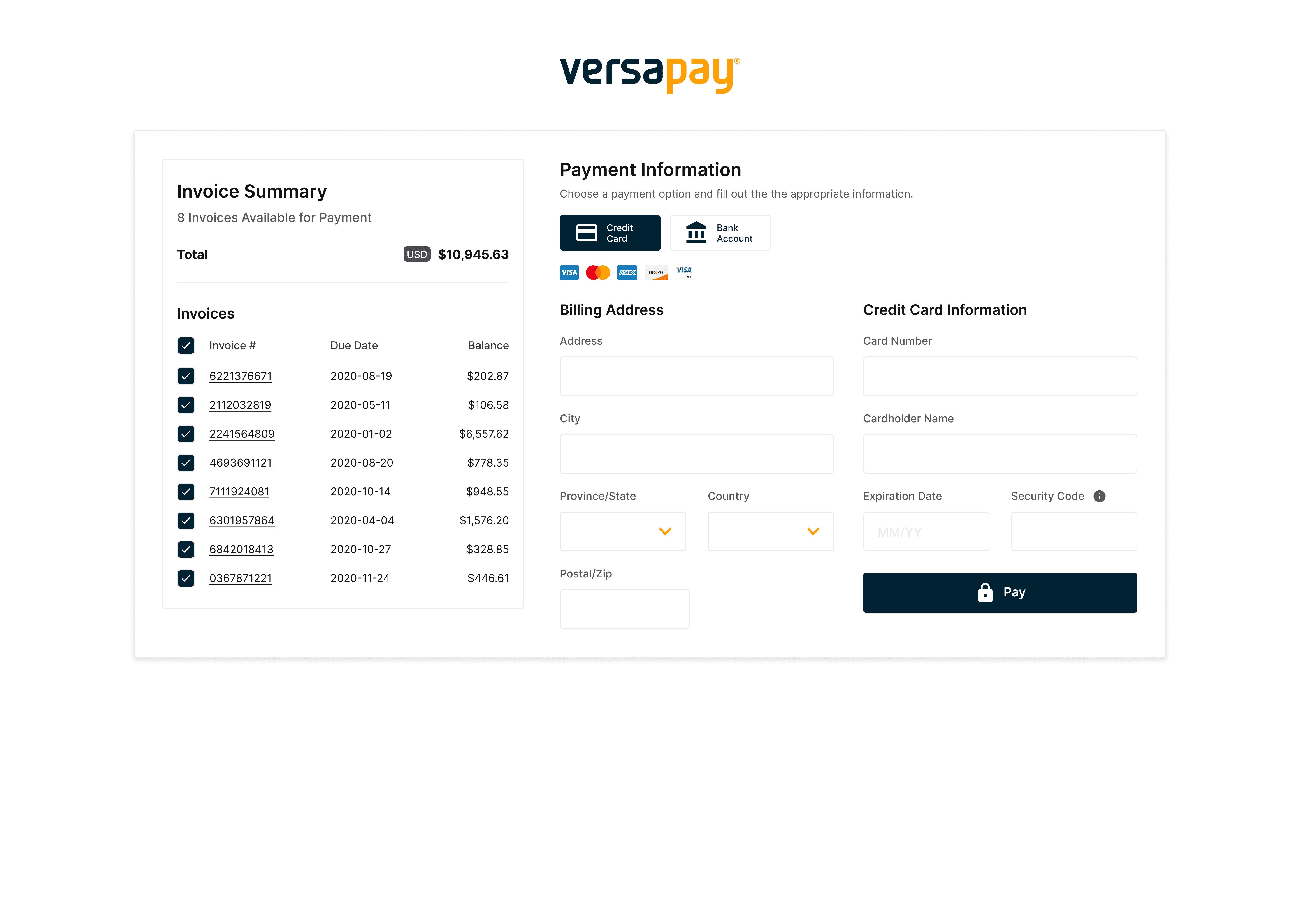
4th Iteration Credit Card Prototype
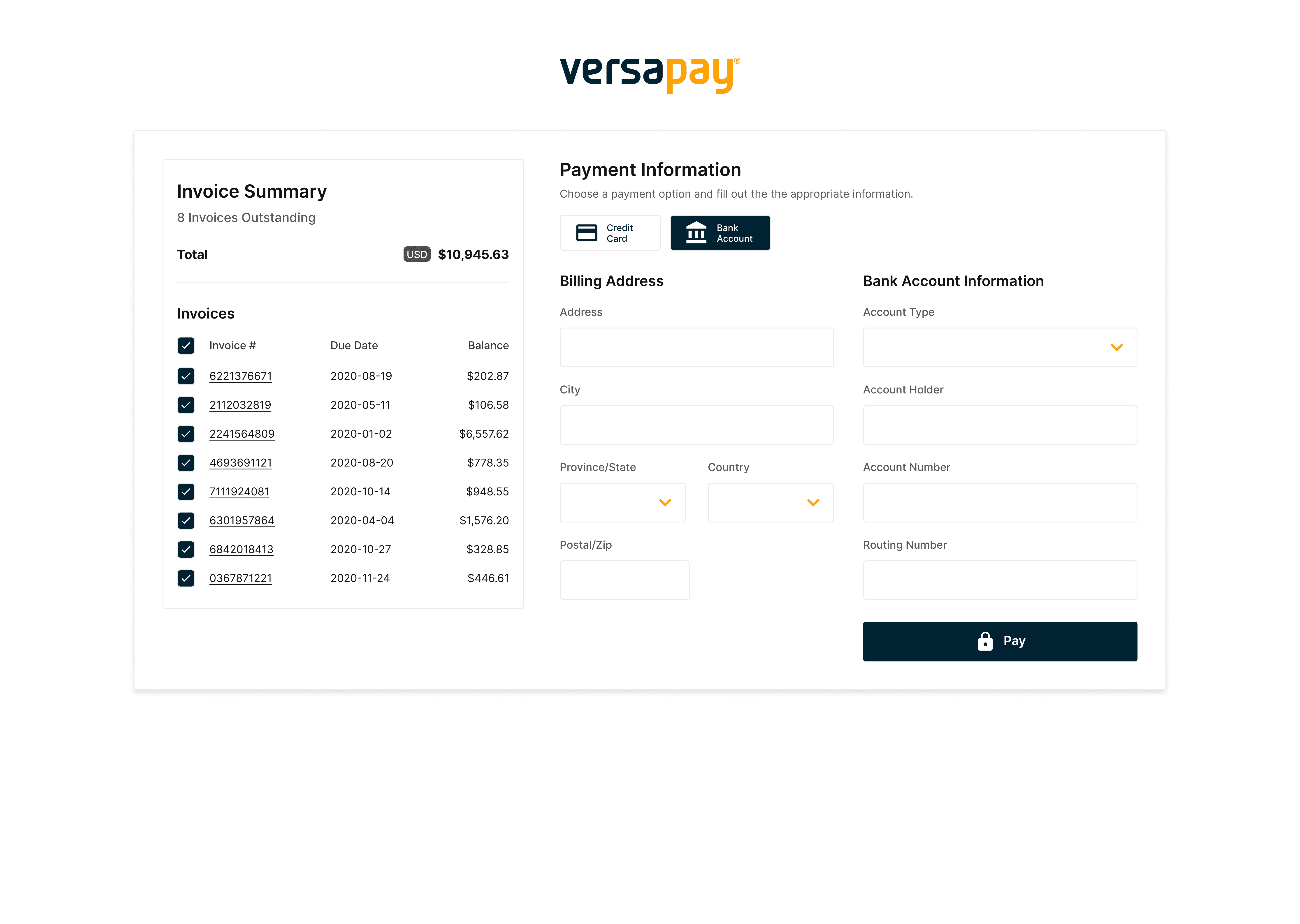
4th Iteration Bank Account Prototype
The final step in the flow that needed to be outlined was the inclusion of a final Payment Complete page that would indicate to the users that their payment had been either successfully or unsuccessfully processed. Overall there ended up being 7 different versions of this page that could be presented to the users depending on their system configuration. Below is an example of a design for the most common layout which presented the payment information back to the user, and also included a “Set Password” field for them to create an account as they are a user that is not currently connected to the Versapay Customer Portal.
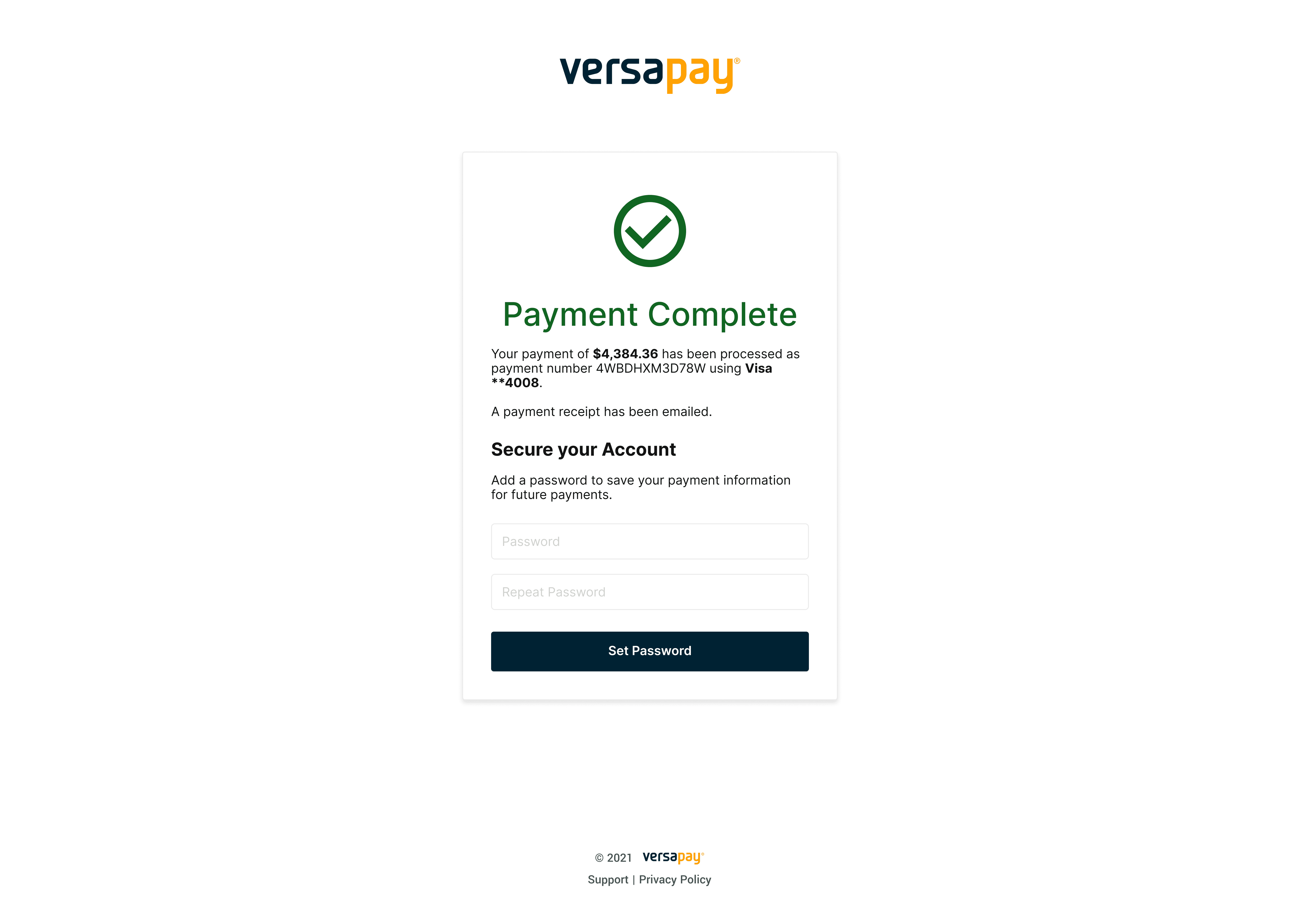
Scenario 1 of the Payment Complete Page
——
LEARNINGS
Fast Adoption of the Payment Page.
Following the completion of the designs, a final review was done with a group of 8 end-users to see how well the proposed flow met their requirements. To do this I leveraged Figma to develop a prototyped flow of the new designs and had the users run through the various flows that we offered.
Once the users were done with the flows, we had them answer a series of System Usability Scale (SUS) questions to assess their opinions about the page. All 8 of the users found the new designs to be very usable with the designs receiving a SUS score of 91, which surpasses the benchmark of 68.
With this successful round of usability testing, the designs were approved to proceed to the engineering phase. Once the engineering work was completed, the flow was launched in late Q1 of 2021. Upon its launch, our intial analysis showed that the the new Pay-Now Page was experiencing a very high conversion rate of 73%. The project stakeholders viewed the initial conversion rate as a great success for the initiative, but the metrics will continue to be monitored over time to identify if there is any regression in the usage of the page.
——
NEXT STEPS
Ecommerce Checkout Flow.
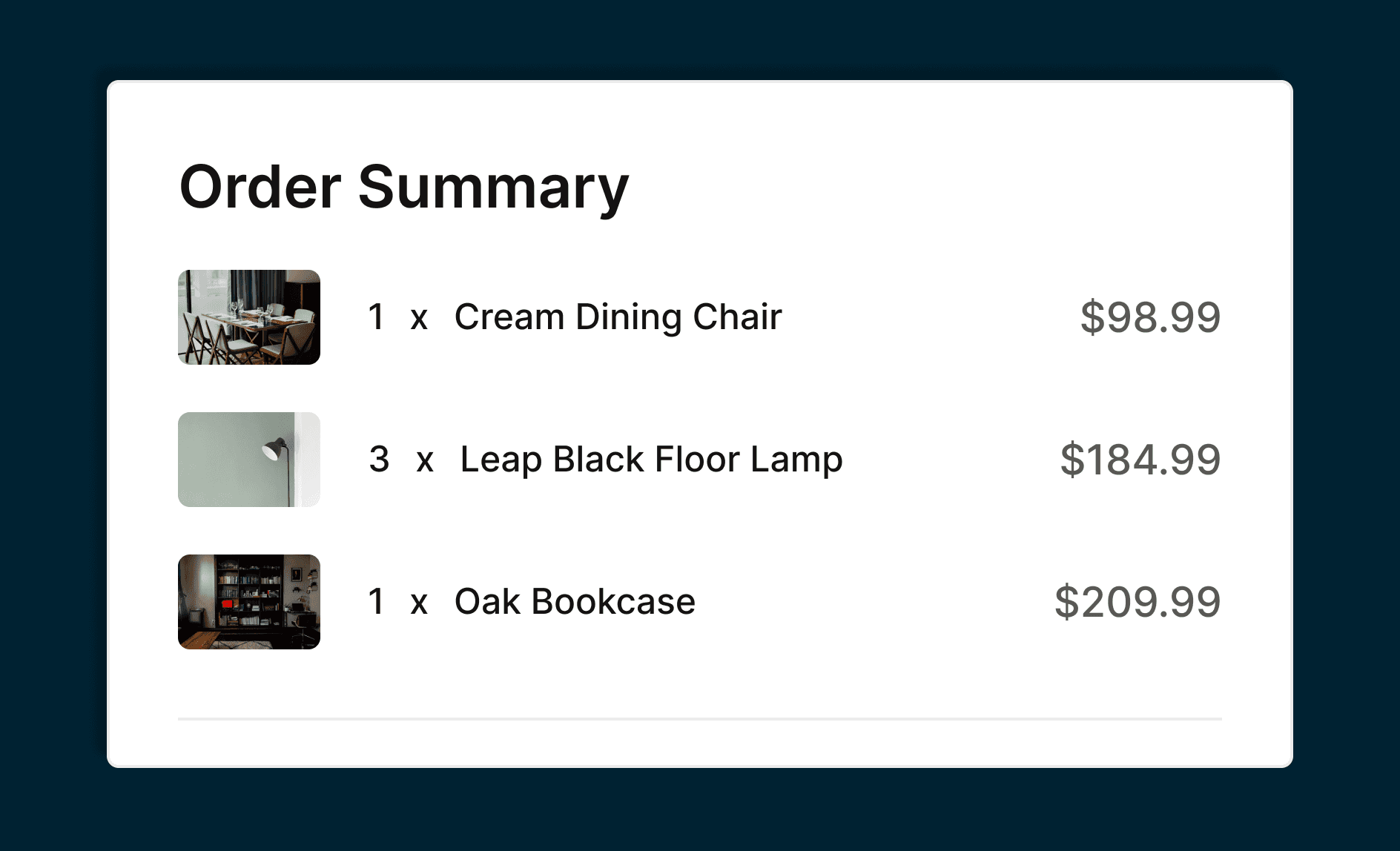
As a next step for the project, I wanted to prototype an e-commerce checkout design of the Pay-Now Page to have that design completed for the ensuing phase of the project. For this, I swapped out the Invoice Listing section of the page and inserted an Order Summary section that lists out the items included in the order.

Ecommerce Checkout Design
